Table of Contents
Introduction
In the previous part of the Working with Statistics Canada Data in R series, we have retrieved the following key labor force indicators from the 2016 Canadian census for Canada as a country and for the largest metropolitan areas in each of Canada’s five geographic regions:
- labor force participation rate, employment rate, and unemployment rate,
- percent of workers by work situation: full time vs part time, by gender, and
- education levels of people aged 25 to 64, by gender.
Now we are going to plot the labor force participation rates and the percent of workers by work situation. And in the next post, I’ll show how to write functions to automate repetitive plotting tasks using the 2016 Census education data as an example.
As always, let’s start with loading the required packages. Note the ggrepel package, which helps to prevent overlapping of data points and text labels in our graphics.
Ordered Bar Plot: Labor Force Involvement Rates
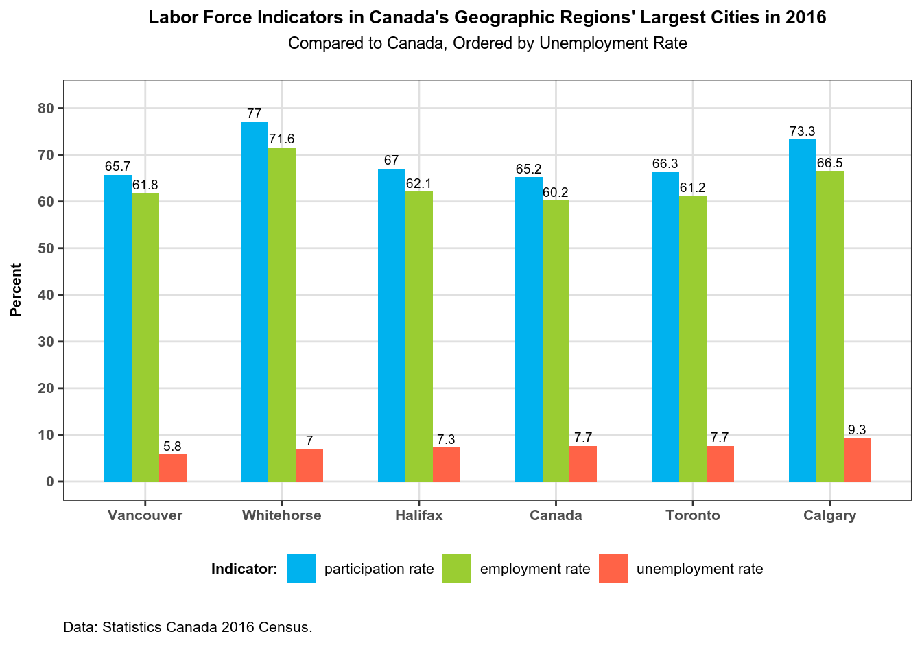
Why the bar plot for this data? Well, the bar plot is one of the simplest and thus easiest to interpret plots, and the data – labor force involvement rates – fits this type of plot nicely. We will plot the rates for all our regions in the same graphic, and we are going to order regions by unemployment rate.
Creating an Ordering Vector
In the previous part of this series, we retrieved 2016 Census data for labor force involvement rates, did some preparatory work required to plot the data with ggplot2 package, and saved the data as the labor dataframe. There is one more step we need to complete before we can plot this data: we need to create an ordering vector with unemployment numbers and append this vector to labor.
# prepare 'labor' dataset for plotting:
# create an ordering vector to set the order of regions in the plot
labor <- labor %>%
  group_by(region) %>%  # groups data by region
  filter(indicator == "unemployment rate") %>%
  select(-indicator) %>%
  rename(unemployment = rate) %>%
  left_join(labor, by = "region") %>%
  mutate(indicator = factor(indicator,
                            levels = c("participation rate",
                                       "employment rate",
                                       "unemployment rate")))
Note the left_join() call, which joins the result of manipulating the labor dataframe back onto labor. If it seems confusing, take a look at this code, which returns the same output:
# alt. (same output):
labor_order <- labor %>%
  filter(indicator == "unemployment rate") %>%
  select(-indicator) %>%
  rename(unemployment = rate)

labor <- labor %>%
left_join(labor_order, by = "region") %>%
mutate(indicator = factor(indicator,
                          levels = c("participation rate",
                                     "employment rate",
                                     "unemployment rate")))
Also note the mutate() call that manually re-assigns factor levels of the indicator variable, so that labor force indicators are plotted in the logical order: first labor force participation rate, then employment rate, and finally the unemployment rate. Remember that ggplot2 plots categorical variables in the order of factor levels.
Making an Ordered Bar Plot
# plot data
plot_labor <-
  labor %>%
  ggplot(aes(x = reorder(region, unemployment),
             y = rate,
             fill = indicator)) +
  geom_col(width = .6, position = "dodge") +
  geom_text(aes(label = rate),
            position = position_dodge(width = .6),
            show.legend = FALSE,
            size = 2.5,
            vjust = -.4) +
  coord_cartesian(ylim = c(0, 82)) + # expand Y axis to prevent labels overlap
  scale_y_continuous(name = "Percent",
                     breaks = seq(0, 80, by = 10)) +
  scale_x_discrete(name = NULL) +
  scale_fill_manual(name = "Indicator:",
                    values = c("participation rate" = "deepskyblue2",
                               "employment rate" = "olivedrab3",
                               "unemployment rate" = "tomato")) +
  theme_bw() +
  theme(plot.title = element_text(hjust = .5,
                                  size = 10,
                                  face = "bold"),
        plot.subtitle = element_text(hjust = .5,
                                     size = 9,
                                     margin = margin(b = 15)),
        panel.grid.major = element_line(colour = "grey88"),
        panel.grid.minor = element_blank(),
        axis.text = element_text(size = 8, face = "bold"),
        axis.title.y = element_text(size = 8,
                                    face = "bold",
                                    margin = margin(r = 8)),
        legend.title = element_text(size = 8, face = "bold"),
        legend.text = element_text(size = 8),
        legend.position = "bottom",
        plot.caption = element_text(size = 8,
                                    hjust = 0,
                                    margin = margin(t = 15))) +
  labs(title = "Labor Force Indicators in Canada's Geographic Regions' Largest Cities in 2016",
       subtitle = "Compared to Canada, Ordered by Unemployment Rate",
       caption = "Data: Statistics Canada 2016 Census.")
Note the x = reorder(region, unemployment) inside the aes() call: this is where we order the plot’s X axis by unemployment rates. Remember that we have grouped our data by region so that we could put regions on the X axis.
Note also the scale_fill_manual() function, where we manually assign colors to the plot’s fill aesthetic.
Saving the Plot
Now that we have made the plot, let’s create the directory where we will be saving our graphics, and save our plot to it:
dir.create("output") # creates folder
ggsave("output/plot_labor.png",
       plot_labor,
       width = 11, height = 8.5, units = "in")
Finally, let’s print the plot to screen:
print(plot_labor)

Faceted Plot: Full Time vs Part Time Workers, by Gender
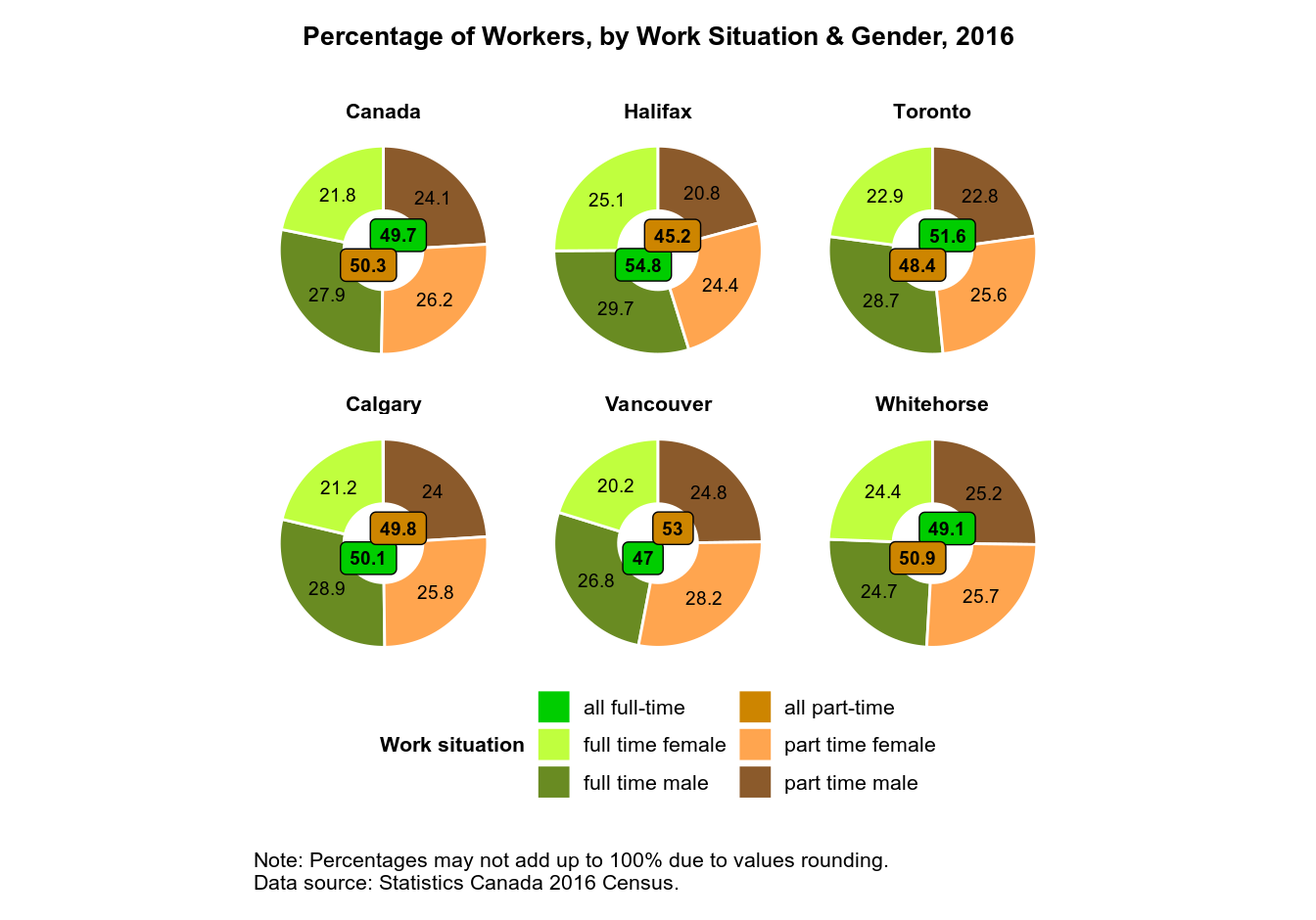
This will be a more complex task compared to plotting labor force participation rates. Here we have the data that is broken down by work situation (full-time vs part-time), and by gender, and also by region. And ideally, we also want the total numbers for full-time and part-time workers to be presented in the same plot. This is too complex to be visualized as a simple bar plot like the one we’ve just made.
To visualize all these data in a single plot, we’ll use faceting: breaking down one plot into multiple sub-plots. And I suggest a donut chart – a variation on a pie chart that has a round hole in the center. Note that generally speaking, pie charts have a well-deserved bad reputation, which boils down to two facts: humans have difficulty visually comparing angles, and if you have many categories in your data, pie charts become an unreadable mess. Here and here you can read more about pie charts’ shortcomings, and which plots can best replace pie charts.
So why an I using a pie chart? Well, three reasons, really. First, we’ll only have four categories inside the chart, so it won’t be messy. Second, it is technically a donut chart, not a pie chart, and it is the empty space inside each donut where I will put the total numbers for full- and part-time workers. And third, I’d like to show how to make donut charts with ggplot2 in case you ever need this, which is not as straightforward as with most other charts, since ggplot2 doesn’t gave a ‘donut’ geom.
Preparing Data for Plotting
In the previous post, we have retrieved the 2016 Census data on the percentage of full-time and part-time workers, by gender, and saved it in the work dataframe. Let’s now prepare the data for plotting. For that, we’ll need to add three more variables. type_gender will be a categorical variable that combines work type and gender – currently these are two different variables. percent will contain percentages for each combination of work type and gender, by region. And percent_type will contain total percentages for full-time and part-time workers, by region.
# prepare 'work' dataset for plotting
work <- work %>%
  group_by(region) %>%
  mutate(type_gender = str_c(type, gender, sep = " ")) %>%
  # percent of workers by region, work type, and gender:
  mutate(percent = round(count/sum(count)*100, 1)) %>%
  # percent of workers by work type, total:
  group_by(region, type) %>%
  mutate(percent_type = sum(percent))
Making a Faceted Donut Plot
Now the dataset is ready for plotting, so let’s make a faceted plot. Since ggplot2 doesn’t like pie charts (of which a donut chart is a variant), there is no ‘pie’ geom, and we’ll have to get a bit hacky with the code. Pay close attention to the in-code comments.
# plot work data (as a faceted plot)
plot_work <-
  work %>%
  ggplot(aes(x = "",
             y = percent,
             fill = type_gender)) +
  geom_col(color = "white") + # sectors' separator color
  coord_polar(theta = "y") +
  geom_text_repel(aes(label = percent),
                  # put text labels inside corresponding sectors:
                  position = position_stack(vjust = .5),
                  force = .005, # repelling force
                  size = 2.5) +
  geom_label_repel(data = distinct(select(work, c("region",
                                                  "type",
                                                  "percent_type"))),
                   aes(x = 0, # turn pie chart into donut chart
                       y = percent_type,
                       label = percent_type,
                       fill = type),
                   size = 2.5,
                   fontface = "bold",
                   force = .007, # repelling force
                   show.legend = FALSE) +
  scale_fill_manual(name = "Work situation",
                    labels = c("full time" = "all full-time",
                               "part time" = "all part-time"),
                    values = c("full time male" = "olivedrab4",
                               "full time female" = "olivedrab1",
                               "part time male" = "tan4",
                               "part time female" = "tan1",
                               "full time" = "green3",
                               "part time" = "orange3")) +
  facet_wrap(~ region) +
  guides(fill = guide_legend(nrow = 3)) +
  theme_void() +
  theme(plot.title = element_text(size = 10,
                                  face = "bold",
                                  margin = margin(t = 10, b = 20),
                                  hjust = .5),
        strip.text = element_text(size = 8, face = "bold"),
        plot.caption = element_text(size = 8,
                                    hjust = 0,
                                    margin = margin(t = 20, b = 10)),
        legend.title = element_text(size = 8, face = "bold"),
        legend.text = element_text(size = 8),
        # change size of symbols (colored squares) in legend:
        legend.key.size = unit(1, "lines"),
        legend.position = "bottom") +
  labs(title = "Percentage of Workers, by Work Situation & Gender, 2016",
       caption = "Note: Percentages may not add up to 100% due to values rounding.\nData source: Statistics Canada 2016 Census.")
There are a number of things in the plot’s code that I’d like to draw your attention to. First, a ggplot2 pie chart is a stacked bar chart (geom_col) made in the polar coordinate system: coord_polar(theta = “y”). For geom_col(), position = “stack” is the default, so it is not specified in the code. Note also that geom_col() needs the x aesthetic, but a pie chart doesn’t have an x coordinate. So I used x = “” to trick geom_col() into thinking it has the x aesthetic, otherwise it would have thrown an error: “geom_col requires the following missing aesthetics: x”.
But how do you turn a pie chart into a donut chart? To do this, I set x = 0 inside the ggrepel::geom_label_repel() aes() call. Try passing different values to x to see how it works: for example, x = 1 turns the plot into a standard pie chart, while x = -1 turns a donut into a narrow ring.
In order to prevent labels overlap, I used ggrepel::geom_text_repel() and ggrepel::geom_label_repel() to add text labels to our plot instead of ggplot2::geom_text() and ggplot2::geom_label(). And position = position_stack(vjust = .5) inside geom_text_repel() puts text labels in the middle of their respective sectors of the donut plot.
The data = distinct(select(work, c(“region”, “type”, “percent_type”)) argument to geom_label_repel() prevents the duplication of labels containing total numbers for full-time and part-time workers.
The scale_fill_manual() is used to manually assign colors and names to our plot’s legend items, and guides(fill = guide_legend(nrow = 3)) changes the order of legend items.
Finally, facet_wrap(~ region) creates a faceted plot, by region.
And just as we did with the previous plot, let’s save our plot to the ‘output’ folder and print it to screen:
ggsave("output/plot_work.png",
       plot_work,
       width = 11, height = 8.5, units = "in")
print(plot_work)
