This is the second part of the Correlation Analysis in R series. In this post, I will provide an overview of some of the packages and functions used to perform correlation analysis in R, and will then address reporting and visualizing correlations as text, tables, and correlation matrices in online and print publications.
Table of Contents
Performing Correlation Analysis: Basic Tools
Comparing stats::cor.test, rstatix::cor_test, and correlation::cor_test
There are multiple packages that allow to perform basic correlation analysis and provide a sufficiently detailed output. By sufficiently detailed I mean more detailed than that of stats::cor(). Of those, I prefer rstatix and correlation (the latter is part of the easystats ecosystem). Both have the function cor_test(), and both are better than stats::cor_test() because they work in a pipe and return output as a dataframe.
Let’s illustrate the use of cor_test() from both packages with the data collected by Gorman, Williams, and Fraser (2014), which is available as the palmerpenguins package. First, let’s install and load the packages, then get data for one penguin species:
# install packages
install.packages("rstatix")
install.packages("correlation")
install.packages("palmerpenguins")
# load packages
library(dplyr)
library(rstatix)
library(correlation)
library(palmerpenguins)

# select Adelie penguins
adelie <- penguins %>%
  filter(species == "Adelie") %>%
  select(c(2, 3, 6)) %>% # keep only relevant data
  drop_na()
Advantages of rstatix::cor_test():
- works in a pipe, unlike
stats::cor.test(), - output is a tibble dataframe, unlike
stats::cor.test(), which returns a list, and unlikecorrelation::cor_test(), which returns a dataframe but not a tibble, - supports quaziquotation, unlike
correlation::cor_test()– you don’t have to remember to put variable names in quotes.
Disadvantages of rstatix::cor_test():
- only allows to calculate confidence intervals (CIs) for Pearson’s \(r\), unlike
correlation::cor_test(), which can calculate CIs for Spearman’s rho \(\rho\) and Kendall’s tau \(\tau\), - knows only three methods for correlation analysis – Pearson’s, Spearman’s, and Kendall’s – vs. 15 (!) methods available in
correlation::cor_test()including the"auto"method, where R tries to guess the best method for you, and - doesn’t report sample size and/or degrees of freedom, unlike
correlation::cor_test().
Let’s illustrate:
# rstatix::cor_test()
rstatix::cor_test(adelie, bill_length_mm, body_mass_g, method = "spearman")

#> # A tibble: 1 x 6
#>   var1           var2          cor statistic        p method
#>   <chr>          <chr>       <dbl>     <dbl>    <dbl> <chr>
#> 1 bill_length_mm body_mass_g  0.55   258553. 2.77e-13 Spearman

# correlation::cor_test()
correlation::cor_test(adelie, x = "bill_length_mm", y = "body_mass_g", method = "spearman")

#> Parameter1     |  Parameter2 |  rho |       95% CI |        S |      p |   Method | n_Obs
#> -----------------------------------------------------------------------------------------
#> bill_length_mm | body_mass_g | 0.55 | [0.42, 0.65] | 2.59e+05 | < .001 | Spearman |   151
Most R packages, including stats, rstatix, and correlation, use Pearson’s correlation coefficient \(r\) as the default method for correlation analysis, so you’ll need to expressly assign a method argument if you need to compute a different coefficient.
Both rstatix::cor_test() and correlation::cor_test() support directional hypothesis testing, even though in the latter case the directional option is not documented in the help returned by ?correlation::cor_test:
rstatix::cor_test(adelie, bill_length_mm, body_mass_g,
                  alternative = "greater")

#> # A tibble: 1 x 8
#>   var1           var2          cor statistic        p conf.low conf.high method
#>   <chr>          <chr>       <dbl>     <dbl>    <dbl>    <dbl>     <dbl> <chr>
#> 1 bill_length_mm body_mass_g  0.55      8.01 1.48e-13    0.447         1 Pearson


correlation::cor_test(adelie, x = "bill_length_mm", y = "body_mass_g",
                      alternative = "greater")

#> Parameter1     |  Parameter2 |    r |       95% CI | t(149) |      p |  Method | n_Obs
#> --------------------------------------------------------------------------------------
#> bill_length_mm | body_mass_g | 0.55 | [0.45, 1.00] |   8.01 | < .001 | Pearson |   151
Retrieving p-values and Confidence Intervals
Even if your analysis does not immediately return a p-value or a CI for your chosen method, correlation package provides two functions that can calculate them for nearly any method in existence: cor_to_p() and cor_to_ci(). These functions take:
- your correlation coefficient (or a correlation matrix),
- sample size,
- confidence level (95% set as default), and
- method (see
?correlation::cor_to_cifor a full list).
Let’s illustrate using the values returned by our analysis of correlation between bill length and body mass in Adelie penguins, for Spearman’s \(\rho\) coefficient:
# p-value
correlation::cor_to_p(.55, n = 151, method = "spearman")

#> $p
#> [1] 2.581667e-13
#>
#> $statistic
#> [1] 8.038661

# CI with default confidence level
correlation::cor_to_ci(.55, n = 151, method = "spearman")

#> $CI_low
#> [1] 0.4239604
#>
#> $CI_high
#> [1] 0.6551406

# CI with 99% confidence level
correlation::cor_to_ci(.55, n = 151, ci = 0.99, method = "spearman")

#> $CI_low
#> [1] 0.3802826
#>
#> $CI_high
#> [1] 0.683883
As of the time of writing this, cor_to_p() and cor_to_ci() do not support directional hypothesis testing.
Correlation Matrix
A correlation matrix is simply a table containing correlation coefficients for pairs of variables. It is useful when you need to report coefficients (and sometimes their p-values too) for more than two variables. Here is what it looks like:
# clean up missing data
penguins <- drop_na(penguins)

# make correlation matrix
cmat <- rstatix::cor_mat(penguins, names(select_if(penguins, is.numeric)))
cmat

#> # A tibble: 5 x 6
#>   rowname           bill_length_mm bill_depth_mm flipper_length_mm body_mass_g   year
#> * <chr>                      <dbl>         <dbl>             <dbl>       <dbl>  <dbl>
#> 1 bill_length_mm             1            -0.23              0.65        0.59   0.033
#> 2 bill_depth_mm             -0.23          1                -0.580      -0.47  -0.048
#> 3 flipper_length_mm          0.65         -0.580             1           0.87   0.15
#> 4 body_mass_g                0.59         -0.47              0.87        1      0.022
#> 5 year                       0.033        -0.048             0.15        0.022  1
You can reorder a correlation matrix by coefficient:
# correlation matrix, ordered by coefficient
rstatix::cor_reorder(cmat)

#> # A tibble: 5 x 6
#>   rowname           bill_depth_mm   year bill_length_mm flipper_length_mm body_mass_g
#> * <chr>                     <dbl>  <dbl>          <dbl>             <dbl>       <dbl>
#> 1 bill_depth_mm             1     -0.048         -0.23             -0.580      -0.47
#> 2 year                     -0.048  1              0.033             0.15        0.022
#> 3 bill_length_mm           -0.23   0.033          1                 0.65        0.59
#> 4 flipper_length_mm        -0.580  0.15           0.65              1           0.87
#> 5 body_mass_g              -0.47   0.022          0.59              0.87        1
It is also possible to extract significance levels from the correlation matrix with rstatix::cor_get_pval(), which returns a table of numeric p-values:
# matrix of p-values
rstatix::cor_get_pval(cmat)

#> # A tibble: 5 x 6
#>   rowname           bill_length_mm bill_depth_mm flipper_length_mm body_mass_g    year
#>   <chr>                      <dbl>         <dbl>             <dbl>       <dbl>   <dbl>
#> 1 bill_length_mm          0.            2.53e- 5         7.21e- 42   1.54e- 32 0.553
#> 2 bill_depth_mm           2.53e- 5      0.               4.78e- 31   7.02e- 20 0.381
#> 3 flipper_length_mm       7.21e-42      4.78e-31         0.          3.13e-105 0.00574
#> 4 body_mass_g             1.54e-32      7.02e-20         3.13e-105   0.        0.691
#> 5 year                    5.53e- 1      3.81e- 1         5.74e-  3   6.91e-  1 0
You can also get a correlation matrix with both coefficients (as numbers) and p-values (as symbols). By default, the symbols and their meanings are: **** \(\leq\) .0001, *** \(\leq\) .001, ** \(\leq\) .01, * \(\leq\) .05, no symbol \(=\) not significant. You can assign your own symbols and significance cut-off points with the symbols and cutpoints arguments, respectively.
rstatix::cor_mark_significant(cmat)

#>             rowname bill_length_mm bill_depth_mm flipper_length_mm body_mass_g year
#> 1    bill_length_mm
#> 2     bill_depth_mm      -0.23****
#> 3 flipper_length_mm       0.65****     -0.58****
#> 4       body_mass_g       0.59****     -0.47****          0.87****
#> 5              year          0.033        -0.048            0.15**       0.022
If you don’t like the matrix format, you can pivot the matrix to a long format with rstatix::cor_gather() as a dataframe of paired variables. The returned table will show both the coefficients and the p-values as numbers. Note that the table might get quite long depending on the number of correlated variables:
rstatix::cor_gather(cmat)

#> # A tibble: 25 x 4
#>    var1              var2              cor        p
#>    <chr>             <chr>           <dbl>    <dbl>
#>  1 bill_length_mm    bill_length_mm  1     0.
#>  2 bill_depth_mm     bill_length_mm -0.23  2.53e- 5
#>  3 flipper_length_mm bill_length_mm  0.65  7.21e-42
#>  4 body_mass_g       bill_length_mm  0.59  1.54e-32
#>  5 year              bill_length_mm  0.033 5.53e- 1
#>  6 bill_length_mm    bill_depth_mm  -0.23  2.53e- 5
#>  7 bill_depth_mm     bill_depth_mm   1     0.
#>  8 flipper_length_mm bill_depth_mm  -0.580 4.78e-31
#>  9 body_mass_g       bill_depth_mm  -0.47  7.02e-20
#> 10 year              bill_depth_mm  -0.048 3.81e- 1
#> # … with 15 more rows
An opposite function rstatix::cor_spread() spreads a long correlation dataframe into a correlation matrix:
cmat_long <- cor_gather(cmat)
rstatix::cor_spread(cmat_long)

#> # A tibble: 5 x 6
#>   rowname           bill_length_mm bill_depth_mm flipper_length_mm body_mass_g   year
#>   <chr>                      <dbl>         <dbl>             <dbl>       <dbl>  <dbl>
#> 1 bill_length_mm             1            -0.23              0.65        0.59   0.033
#> 2 bill_depth_mm             -0.23          1                -0.580      -0.47  -0.048
#> 3 flipper_length_mm          0.65         -0.580             1           0.87   0.15
#> 4 body_mass_g                0.59         -0.47              0.87        1      0.022
#> 5 year                       0.033        -0.048             0.15        0.022  1
Reporting Correlation Analysis
Reporting as Text
Reporting correlation coefficients is pretty easy: you just have to say how big they are and what their significance value is. When reporting, keep the following things in mind (Field, Miles, and Field 2012, 241):
- Coefficients are usually (for example, in APA style) reported to two decimal places. There should be no zero before the decimal point for the correlation coefficient or the probability value (because neither can exceed 1).
- There are standard probabilities you can use when reporting \(p\) (.05, .01, .001, and .0001). If \(p \geq .001\), report the exact p-value, otherwise you can simply report \(p < .001\).
- If you are reporting a one-tailed probability, you should expressly state so, as by default probabilities are assumed to be two-tailed.
- Use a correct letter to represent your correlation coefficient, such as Pearson’s \(r\), Kendall’s \(\tau\), or Spearman’s \(\rho\).
- Remember to report your sample size (as \(n = sample\:size\)) or degrees of freedom (APA requires degrees of freedom in parentheses next to \(r\)). Just remember that for Pearson’s \(r\), \(df = n\:–\:2\). For non-parametric tests, report only sample size.
- It is also recommended to report the test statistic (for Pearson’s \(r\), it would be \(t\)-statistic).
- Confidence intervals should be provided whenever possible in addition to the results of the hypothesis test, with confidence level matched to the significance level chosen for the test (e.g. 95% CI for \(p \leq .05\), 99% CI for \(p \leq .01\)); if no inference to the population is intended, report standard deviation of the mean instead of CI (Sim and Reid 1999).
For example, the results of this test:
correlation::cor_test(adelie, x = "bill_length_mm", y = "body_mass_g")

#> Parameter1     |  Parameter2 |    r |       95% CI | t(149) |      p |  Method | n_Obs
#> --------------------------------------------------------------------------------------
#> bill_length_mm | body_mass_g | 0.55 | [0.43, 0.65] |   8.01 | < .001 | Pearson |   151
Can be reported as follows:
Our research shows a highly significant positive correlation between bill length and body mass among Adelie penguins: \(t\) = 8.01, \(p\) < .001, Pearson’s \(r\)(149) = .55, \(n\) = 151, 95% CI [0.43, 0.65].
Reporting Spearman’s or Kendall’s correlation coefficients would be similar, but without degrees of freedom.1
Reporting as Table
You have no doubt noticed that the results of statistical models are often reported as nicely formatted tables in peer-reviewed journals. So far, our correlations have been reported as plain text tables with a monospaced font. Which means they look a bit ugly. Fortunately, R has a multitude of packages designed to format tables. You can find a brief overview of most (although certainly not all) of them here.
My criteria for choosing the best packages to format tables are simple. First and foremost, the package should be fully compatible with R Markdown, which I use for nearly all my writing (and you should too, because of how much better it is than MS Word legacy software with horrible UI).2 This means that when you knit your Rmd, the table should render correctly in at least the following formats: HTML, PDF, Word, PowerPoint, and ideally, also OpenDocument and LaTeX. The package should also be easy to use and well-documented.
Upon some research, I think that the best options are:
-
huxtable– supports most formats and is well-documented, -
flextable– the best documented, and -
gtsummary– the simplest. Althoughgtsummaryrenders natively as HTML only, its output can be converted to huxtable or flextable objects, which in turn can be rendered as pretty much anything. Also,huxtableandflextableare highly versatile and can be used to format any tables, regardless of their contents.gtsummaryis primarily intended to format the output of commonly used statistical models.
I personally prefer huxtable because it supports the largest number of formats (for some to work, you may still need flextable to be installed) and has a simple, straightforward syntax.
# install packages for table formatting
install.packages("huxtable")
install.packages("flextable")
Avoid loading huxtable and flextable at the same time, as there will be conflicts between some of their functions. Or if you have to, call functions using the packagename:: syntax.
Let’s now demonstrate huxtable in action by formatting the results of our correlation analysis:
# make huxtable
adelie_ht <- rstatix::cor_test(adelie,
                               bill_length_mm, body_mass_g,
                               method = "spearman") %>%
  as_huxtable() %>%
  set_all_padding(row = everywhere, col = everywhere, value = 6) %>%
  set_bold(1, everywhere) %>%
  set_top_border(1, everywhere, value = 0.8) %>%
  set_bottom_border(1, everywhere, value = 0.4) %>%
  set_caption("Correlation between Body Mass and Bill Length in Adelie Penguins")
# render huxtable
adelie_ht
In some situations, you might need to render a huxtable object as an image, e.g. to combine it with a ggplot object or for other purposes. For example, I had to do this for compatibility with the goodpress package, which for some reason can’t process huxtable HTML output. To render your huxtable as an image, you’ll first need to convert it to a flextable object with huxtable::as_flextable(), and then render with flextable::as_raster().3
# render huxtable as an image
adelie_ht %>%
  as_flextable() %>%
  flextable::as_raster(.)

Refer to the huxtable documentation for the details about what these functions do. Note that some table formatting options work only for the specific output types. For example, higher visual weight of the top border (value = 0.8) renders correctly in PDF, but in HTML both borders render as having equal weight. Not sure if this is a bug or a feature.
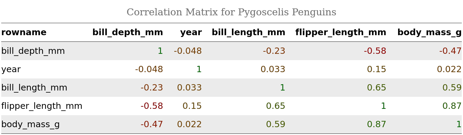
As a more advanced example, let’s format our correlation matrix cmat. First, let’s reorder it by correlation coefficient, and then let’s render coefficients in different color fonts depending on the coefficient’s sign and magnitude:
cmat_ht <- rstatix::cor_reorder(cmat) %>%
  as_huxtable() %>%
  set_all_padding(row = everywhere, col = everywhere, value = 6) %>%
  set_bold(1, everywhere) %>%
  set_background_color(evens, everywhere, "grey92") %>%
  map_text_color(-1, -1, by_colorspace("red4", "darkgreen")) %>%
  set_caption("Correlation Matrix for Pygoscelis Penguins") %>%
  set_col_width(everywhere, value = c(.16, .15, .11, .2, .2, .2)) %>%
  set_width(1.02) %>% # note how sum of col widths == total table width
  theme_article() # yes, there are themes!
cmat_ht %>%
  as_flextable() %>%
  flextable::as_raster(.)
In case you are using R Markdown for your reporting and are rendering to PDF, keep in mind that you won’t be able to format table captions with HTML tags like here: set_caption("<b>Correlation Matrix for Pygoscelis Penguins</b>"), because they will be rendered literally (as “<b>” and “</b>”). However, this works for HTML.
Also keep in mind that the best YAML settings for PDF output would be:
output:
  pdf_document:
    latex_engine: xelatex
This will work well for complex or unusual LaTeX syntax, which may otherwise cause “Unicode character … not set up for use with LaTeX when knitting to pdf” error.
Just to illustrate how PDF output would look, here is this post rendered to PDF from R Markdown. Looks nice, doesn’t it?
Visualizing Correlation Matrix
rstatix has a function to visualize correlation matrices: cor_plot(). However, rstatix::cor_plot() does not return a ggplot object, and thus:
- can’t take
ggplot2themes or custom theme objects, - makes it harder to define a custom color palette, and
- most importantly,
rstatix::cor_plot()output can’t be further customized or annotated usingggplot2themes or packages such asggpubr.4
Therefore, I would instead recommend using ggcorrplot::ggcorrplot() which returns a ggplot object that can be altered, customized, or annotated using a broad ecosystem of ggplot2-based packages. Another great package is latex2exp. It allows you to render LaTeX expressions inside plot objects, which is very handy if you’d like to use special symbols or Greek letters in your plot’s text elements.
# install ggcorrplot and ggpubr
install.packages("ggcorrplot")
install.packages("ggpubr")
install.packages("latex2exp")
# load ggcorrplot and ggpubr
library(ggcorrplot)
library(ggpubr)
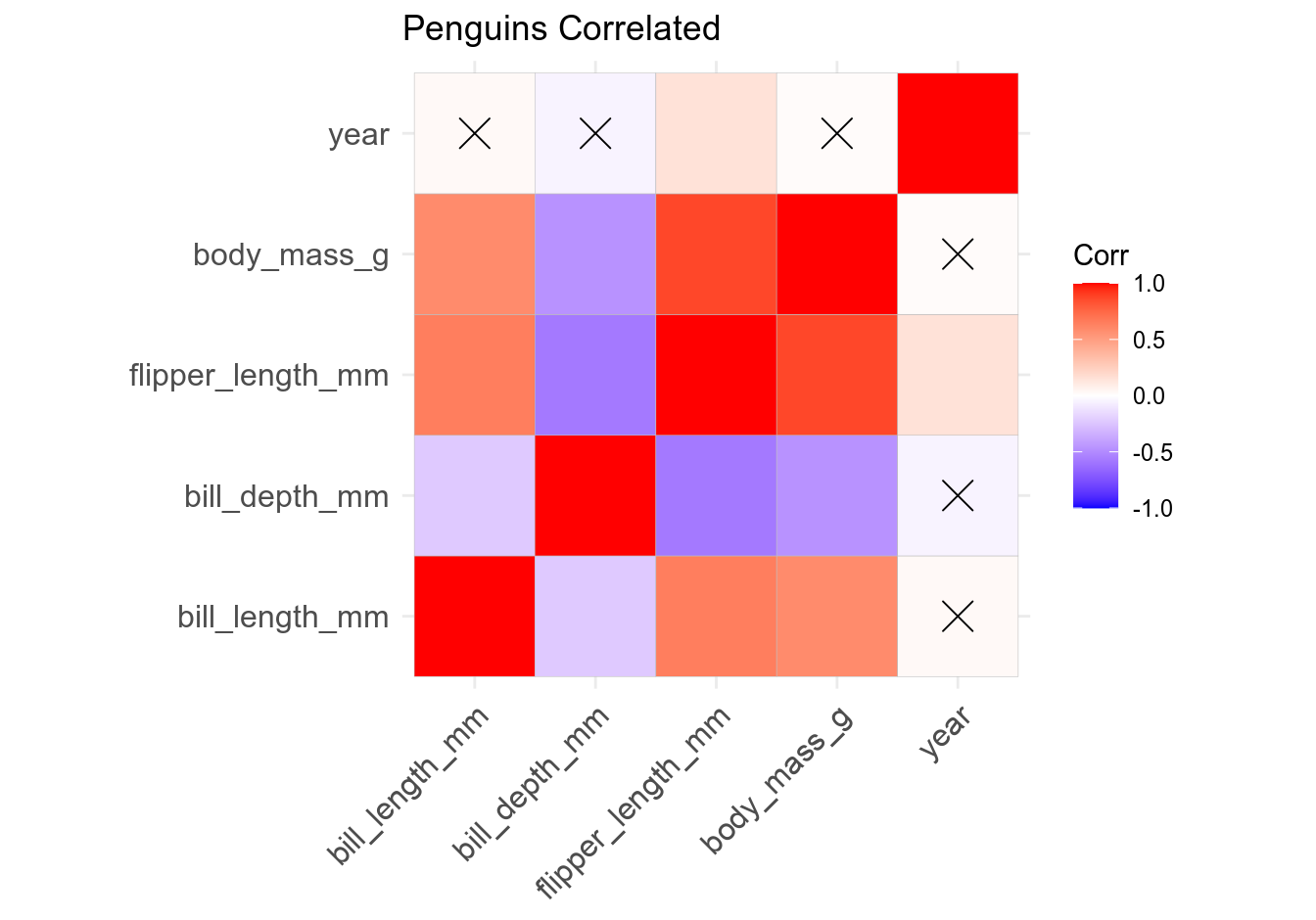
There are two main ways to visualize a correlation matrix: as a square plot where correlations are duplicated (remember that \(CORxy = CORyx\)) and self-correlations (\(r = 1\)) are included, and as a half-square plot where correlation coefficients are not duplicated and self-correlations are excluded. Optionally, you can also add correlation coefficients to the plot, mark statistically non-significant correlations or completely exclude them, change the plot’s color scheme, etc. Since ggcorrplot() returns a ggplot2 object, it can be further altered (e.g. by adding subtitle, annotations, captions, etc.) using ggpubr::ggpar(), ggpubr::annotate_figure(), and similar functions.
# ggcorrplot - basic
ggcorrplot(cmat, title = "Penguins Correlated")
Let’s now customize the plot by removing self-correlations, leaving non-significant coefficients blank, assigning a different color palette, reordering the plot by correlation coefficient, choosing plot theme, and adding subtitle and caption. Pay attention to comments in the code:
# ggcorrplot - customized
ggcorrplot(cmat, # takes correlation matrix
           title = "Penguins Correlated",
           ggtheme = theme_classic, # takes ggplot2 and custom themes
           colors = c("red", "white", "forestgreen"), # custom color palette
           hc.order = TRUE, # reorders matrix by corr. coeff.
           type = "upper", # prevents duplication; also try "lower"
           lab = TRUE, # adds corr. coeffs. to the plot
           insig = "blank", # wipes non-significant coeffs.
           lab_size = 3.5) %>%
  # add subtitle and caption; note rendering LaTeX symbols in ggplot objects
  ggpubr::ggpar(subtitle = latex2exp::TeX("Significant correlations only (p$\\leq$.05)",
                                          output = "text"),
                caption = "Data: Gorman, Williams, and Fraser 2014")
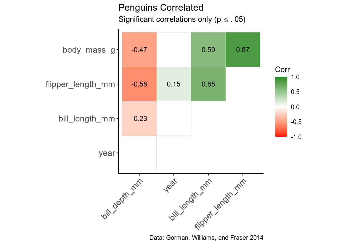
Note how you can render LaTeX symbols inside ggplot objects with latex2exp::TeX() function.
Hopefully, I’ve managed to provide some useful tips on performing and reporting correlation analysis. The next post in this series will be dedicated to robust methods for correlation analysis.
This post is also available as a PDF.
Bibliography
Field, Andy, Jeremy Miles, and Zoë Field. 2012. Discovering Statistics Using R. First edit. London, Thousand Oaks, New Delhi, Singapore: SAGE Publications.
Gorman, Kristen B., Tony D. Williams, and William R. Fraser. 2014. “Ecological sexual dimorphism and environmental variability within a community of Antarctic penguins (Genus Pygoscelis).” PLoS ONE 9 (3). https://doi.org/10.1371/journal.pone.0090081.
Sim, Julius, and Norma Reid. 1999. “Statistical inference by confidence intervals: Issues of interpretation and utilization.” Physical Therapy 79 (2): 186–95. https://doi.org/10.1093/ptj/79.2.186.
-
Also note that the magnitude of Spearman’s correlation is usually very close to Pearson’s, but Kendall’s is not. For small samples, Kendall’s \(\tau\) gives a more accurate estimate of the correlation in the population, particularly when your ranked data (ranked because it is a non-parametric test) has a lot of tied ranks (Field, Miles, and Field 2012, 225). More on this later in the series.↩︎
-
For example, all posts in my blog are written in R Markdown and deployed to WordPress directly from R using the
goodpresspackage. Changing a single setting in the post’s YAML header (which takes a few seconds) can turn it into a nicely formatted HTML page, PDF article, MS Word or LibreOffice document, etc.↩︎ -
You’ll also need to have packages
webshotandmagickinstalled, along with their system dependencies.↩︎ -
If you try, it will return “Error in ggpubr…: Can’t handle an object of class matrix”.↩︎
Pingback: Correlation Analysis in R, Part 2: Performing and Reporting Correlation Analysis – Data Science Austria
Pingback: Correlation Analysis in R, Part 2: Performing and Reporting Correlation Analysis | R-bloggers
Pingback: Reporting on Correlation Analysis in R – Curated SQL