Table of Contents
Introduction
There are multiple ways to style or theme a Shiny app. A high-level overview is available in the Mastering Shiny book by Hadley Wickham. Here I’ll show the easiest way to do this. If you need to build an entirely – or mostly – new Shiny theme (e.g. a corporate theme), this post is probably not for you. In that case bslib may be the best starting point. Otherwise, if you are generally happy with a pre-made theme and just want to tweak some of its elements, read on.
This post is based on an actual app, so that you can see how it all works. Here’s the app’s source.
Base Theme
The first step in styling your app is to choose a base theme. Some good pre-made options are available from the shinythemes package and can be added using shinythemes::shinytheme(). Bootswatch themes can be selected with bslib::bs_theme().
navbarPage(
  title = "Calgary Crime Data Explorer",
  theme = shinythemes::shinytheme("readable"),
  ...
)
Note how the base theme is passed to the theme argument of the shiny::...Page() function, in this case navbarPage(). Other functions that create page layouts (fluidPage(), fillPage(), etc.) also allow to assign a theme.
Changes to the Base Theme
If there is anything about the base theme you’d like to change, do it by changing individual CSS elements, like this:
ui <- fluidPage(

  ## Custom style
  tagList(
    # CSS for navbar elements
    tags$style(
      HTML('.navbar {font-size: 17px;}',
           '.navbar-default .navbar-brand {color: #262626; font-weight: bold}',
           '.navbar-default .navbar-brand:hover {color: #262626;}',
           '.navbar-default .navbar-nav > li > a {color: #262626;}')
    ),
    # CSS for fonts
    tags$style('h3 {font-weight: normal;}',
               'h4 {font-weight: normal;}',
               '* {font-family: Ubuntu;}'),
    # CSS for all buttons (class .btn)
    tags$style('.btn {color: #333333;
                      background-color: #eeeeee;
                      border-color: #cccccc;}
                .btn:hover {background-color: #e1e1e1;}'),
    # CSS for errors and validation messages
    tags$style('.shiny-output-error-validation {
                 color: #e35300;
                 font-weight: bold;}'),
    # CSS for individual elements: note the '#id' syntax
    tags$style('#map-readme {color: #333333;
                             background-color: #ff770050;
                             border-color: #c84407;}
                #map-readme:hover {background-color: #e36a0075;}
                #trend-readme {color: #333333;
                               background-color: #ff770050;
                               border-color: #c84407;}
                #trend-readme:hover {background-color: #e36a0075;}')
  ), # end of style block
  # Note how both styling *and* navbarPage are within fluidPage.
  # Styling won't work if placed directly inside navbarPage due to
  # "Error in: Navigation containers expect a collection of ... (stuff that is not tags)"


  ## UI definition begins
  navbarPage(
    title = "Calgary Crime Data Explorer",
    theme = shinythemes::shinytheme("readable"),
    ...
  ) # UI definition ends

) # fluidPage ends
Note that the navbarPage() call contains UI definition and should not have styling inside it (except theme = shinythemes::shinytheme("readable")). Placing tags$style() inside navbarPage() will result in "Error in: Navigation containers expect a collection of ... (stuff that is not tags)" message.
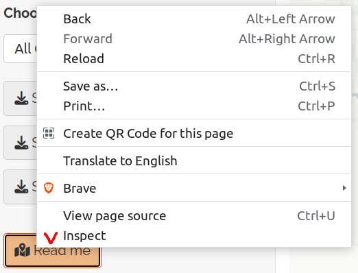
How do I know which CSS selector to refer to? Right-click on the element you’d like to change and choose “Inspect”, which will open up the page’s HTML:

The element you’ve clicked on should be highlighted:

To make changes to all elements of a class, tag this class. For example, to change the appearance of all buttons, tag class .btn: tags$style('.btn {color: #333333; ...other CSS changes...}').
If you need to change just one specific element (here, one button), use the id selector instead of a class selector: tags$style('#map-readme {color: #333333; ...other CSS changes...}'). Note that referencing a class selector starts with a dot . and referencing an id starts with a hash sigh #.
If you need to change the appearance of an element in a specific state, tag the id selector followed by a pseudo-class: #map-readme:hover, where :hover is a pseudo-class.
Finally, although all CSS tags can be put inside a single tags$style() call, I broke them into separate blocks for readers’ (and my own) convenience. The comments in the code explain what each block does.
Pingback: An Easy Way to Customize Your Shiny App Theme – Data Science Austria
Pingback: Customizing a Shiny App Theme – Curated SQL