In the previous part of this series, we have retrieved CANSIM data on the weekly wages of Aboriginal and Non-Aboriginal Canadians of 25 years and older, living in Saskatchewan, and the CPI data for the same province. We then used the CPI data to adjust the wages for inflation, and saved the results as wages_0370 dataset.
Table of Contents
Exploring Data
To get started, let’s take a quick look at the dataset, what types of variables it contains, which should be considered categorical, and what unique values categorical variables have:
# explore wages_0370 before plotting
glimpse(wages_0370)

#> Rows: 39
#> Columns: 6
#> $ year            <chr> "2007", "2007", "2007", "2008", "2008", "2008", "2009", "2009", "2009", "…
#> $ group           <chr> "First Nations", "Métis", "Non-Aboriginal population", "First Nations", "…
#> $ current_dollars <dbl> 707.93, 761.75, 797.31, 675.95, 812.45, 855.09, 793.98, 807.23, 892.58, 8…
#> $ cpi             <dbl> 112.2, 112.2, 112.2, 115.9, 115.9, 115.9, 117.1, 117.1, 117.1, 118.7, 118…
#> $ infrate         <dbl> 0.00000000, 0.00000000, 0.00000000, 0.03297683, 0.03297683, 0.03297683, 0…
#> $ dollars_2007    <dbl> 707.93, 761.75, 797.31, 654.37, 786.51, 827.79, 760.76, 773.45, 855.23, 8…

map(wages_0370, class)

#> $year
#> [1] "character"
#>
#> $group
#> [1] "character"
#>
#> $current_dollars
#> [1] "numeric"
#>
#> $cpi
#> [1] "numeric"
#>
#> $infrate
#> [1] "numeric"
#>
#> $dollars_2007
#> [1] "numeric"

map(wages_0370[c(1, 2)], unique)

#> $year
#>  [1] "2007" "2008" "2009" "2010" "2011" "2012" "2013" "2014" "2015" "2016" "2017" "2018" "2019"
#>
#> $group
#> [1] "First Nations"             "Métis"                     "Non-Aboriginal population"
The first two variables – year and group – are of the type “character”, and `the rest are numeric of the type “double” (“double” simply means they are not integers, i.e. can have decimals).
Also, we can see that wages_0370 dataset is already in the tidy format, which is an important prerequisite for plotting with ggplot2 package. Since ggplot2 is included into tidyverse, there is no need to install it separately.
Preparing Data for Plotting
At this point, our data is almost ready to be plotted, but we need to make one final change. Looking at the unique values, we can see that the first two variables (year and group) should be numeric (integer) and categorical respectively, while the rest are continuous (as they should be).
In R, categorical variables are referred to as factors. It is important to expressly tell R which variables are categorical, because mapping ggplot2 aesthetics – things that go inside aes() – to a factor variable makes ggplot2 use a discrete color scale (distinctly different colors) for different categories (different factor levels in R terms). Otherwise, values would be plotted to a gradient, i.e. different hues of the same color. There are several other reasons to make sure you expressly identify categorical variables as factors if you are planning to visualize your data. I understand that this might be a bit too technical, so if you are interested, you can find more here and here. For now, just remember to convert your categorical variables to factors if you are going to plot your data. Ideally, do it always – it is a good practice to follow.
( ! ) It is a good practice to always convert categorical variables to factors.
So, let’s do it: convert year to an integer, and group to a factor. Before doing so, let’s remove the word “population” from “Non-Aboriginal population” category, so that our plot’s legend takes less space inside the plot. We can also replace accented “é” with ordinary “e” to make typing in our IDE easier. Note that the order is important: first we edit the string values of a “character” class variable, and only then convert it to a factor. Otherwise, our factor will have missing levels.
( ! ) Converting a categorical variable to a factor should be the last step in cleaning your dataset.
wages_0370 <- wages_0370 %>%
  mutate(group = str_replace_all(group, c(" population" = "", "é" = "e"))) %>%
  mutate_at("year", as.integer) %>%
  mutate_if(is.character, as_factor)
Note: if you only need to remove string(s), use str_remove or str_remove_all:
mutate(group = str_remove(group, " population"))
Plotting with ggplot2
Finally, we are ready to plot the data with ggplot2:
plot_wages_0370 <-
  wages_0370 %>%
  drop_na() %>%
  ggplot(aes(x = year, y = dollars_2007,
             color = group)) +
  geom_point(size = 2) +
  geom_line(size = .7) +
  geom_label(aes(label = round(dollars_2007)),
  # alt: use geom_label_repel() # requires ggrepel
             fontface = "bold",
             label.size = .4, # label border thickness
             size = 2, # label size
             # force = .005, # repelling force: requires ggrepel
             show.legend = FALSE) +
  coord_cartesian(ylim = c(650, 1000)) + # best practice to set scale limits
  scale_x_continuous(breaks = 2007:2018) +
  scale_y_continuous(name = "2007 dollars",
                     breaks = seq(650, 1000, by = 50)) +
  scale_color_manual(values = c("First Nations" = "tan3",
                                "Non-Aboriginal" = "royalblue",
                                "Metis" = "forestgreen")) +
  theme_bw() +
  theme(plot.title = element_text(size = 10,
                                  face = "bold",
                                  hjust = .5,
                                  margin = margin(b = 10)),
        plot.caption = element_text(size = 8),
        panel.grid.minor = element_blank(),
        panel.grid.major = element_line(colour = "grey85"),
        axis.text = element_text(size = 8),
        axis.title.x = element_blank(),
        axis.title.y = element_text(size = 9, face = "bold",
                                    margin = margin(r = 10)),
        legend.title = element_blank(),
        legend.position = "bottom",
        legend.text = element_text(size = 9, face = "bold")) +
  labs(title = "Average Weekly Wages, Adjusted for Inflation,\nby Aboriginal Group, 25 Years and Older",
       caption = "Wages data: Statistics Canada Data Table 14-10-0370\nInflation data: Statistics Canada Data Vector v41694489")

print(plot_wages_0370)
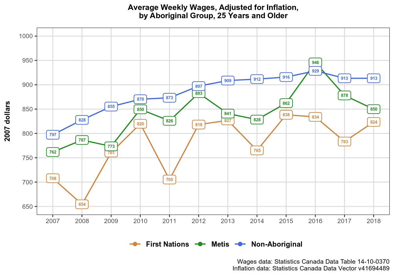
Let’s now look at what this code does. We start with feeding our data object wages_0370 into ggplot function using pipe.
( ! ) Note that ggplot2 internal syntax differs from tidyverse pipe-based syntax, and uses + instead of %>% to join code into blocks.
Next, inside ggplot(aes()) call we assign common aesthetics for all layers, and then proceed to choosing the geoms we need. If needed, we can assign additional/override common aesthetics inside individual geoms, like we did when we told geom_label() to use dollars_2007 variable values (rounded to a dollar) as labels. If you’d like to find out more about what layers are, and about ggplot2 grammar of graphics, I recommend this article by Hadley Wickham.
Choosing Plot Type
Plot type in each layer is determined by geom_*() functions. This is where geoms are:
geom_point(size = 2) +
geom_line(size = .7) +
geom_label(aes(label = round(dollars_2007)),
# alt: use geom_label_repel() # requires ggrepel
           fontface = "bold",
           label.size = .4, # label border thickness
           size = 2.5, # label size
           # force = .005, # repelling force: requires ggrepel
           show.legend = FALSE)
Choosing plot type is largely a judgement call, but you should always make sure to choose the type of graphic that would best suite the data you have. In this case, our goal is to reveal the dynamics of wages in Saskatchewan over time, hence our choice of geom_line(). Note that the lines in our graphic are for visual aid only – to make it easier for an eye to follow the trend. They are not substantively meaningful like they would be, for example, in a regression plot. geom_point() is also there primarily for visual purposes – to make the plot’s legend more visible. Note that unlike the lines, the points in this plot are substantively meaningful, i.e. they are exactly where our data is (but are covered by labels). If you don’t like the labels in the graphic, you can use points instead.
Finally, geom_label() plots our substantive data. Note that I am using show.legend = FALSE argument – this is simply because I don’t like the look of geom_label() legend symbols, and prefer a combined line+point symbol instead. If you prefer label symbols in the plot’s legend, remove show.legend = FALSE argument from geom_label() call, and add it to geom_line() and geom_point().
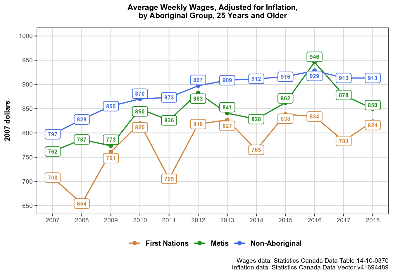
Preventing Overlaps with ggrepel
You have noticed some commented lines in the ggplot() call. You may also have noticed that some labels in our graphic overlap slightly. In this case the overlap is minute and can be ignored. But what if there are a lot of overlapping data points, enough to affect readability?
Fortunately, there is a package to solve this problem for the graphics that use text labels: ggrepel. It has *_repel() versions of ggplot2::geom_label() and ggplot2::geom_text() functions, which repel the labels away from each other and away from data points.
install.packages("ggrepel")
library("ggrepel")
ggrepel functions can take the same arguments as corresponding ggplot2 functions, and also take the force argument that defines repelling force between overlapping labels. I recommend setting it to a small value, as the default 1 seems way too strong.
Here is what our graphic looks like now. Note that the nearby labels no longer overlap:
Axes and Scales
This is where plot axes and scales are defined:
coord_cartesian(ylim = c(650, 1000)) + # best practice to set scale limits
scale_x_continuous(breaks = 2007:2018) +
scale_y_continuous(name = "2007 dollars",
                   breaks = seq(650, 1000, by = 50)) +
scale_color_manual(values = c("First Nations" = "tan3",
                              "Non-Aboriginal" = "royalblue",
                              "Metis" = "forestgreen"))
coord_cartesian() is the function I’d like to draw your attention to, as it is the best way to zoom the plot, i.e. to get rid of unnecessary empty space. Since we don’t have any values less than 650 or more than 950 (approximately), starting our Y scale at 0 would result in a less readable plot, where most space would be empty, and the space where we actually have data would be crowded. If you are interested in why coord_cartesian() is the best way to set axis limits, there is an in-depth explanation.
( ! ) It is a good practice to use coord_cartesian() to change axis limits.
Plot Theme, Title, and Captions
Next, we edit our plot theme:
theme_bw() +
theme(plot.title = element_text(size = 10,
                                face = "bold",
                                hjust = .5,
                                margin = margin(b = 10)),
      plot.caption = element_text(size = 8),
      panel.grid.minor = element_blank(),
      panel.grid.major = element_line(colour = "grey85"),
      axis.text = element_text(size = 8),
      axis.title.x = element_blank(),
      axis.title.y = element_text(size = 9, face = "bold",
                                  margin = margin(r = 10)),
      legend.title = element_blank(),
      legend.position = "bottom",
      legend.text = element_text(size = 9, face = "bold"))
First I selected a simple black-and-white theme theme_bw, and then overrode some of the theme’s default settings in order to improve the plot’s readability and overall appearance. Which theme and settings to use is up to you, just make sure that whatever you do makes the plot easier to read and comprehend at a glance. Here you can find out more about editing plot theme.
Finally, we enter the plot title and plot captions. Captions are used to provide information about the sources of our data. Note the use of (new line symbol) to break strings into multiple lines:
labs(title = "Average Weekly Wages, Adjusted for Inflation,\nby Aboriginal Group, 25 Years and Older",
     caption = "Wages data: Statistics Canada Data Table 14-10-0370\nInflation data: Statistics Canada Data Vector v41694489")
Saving Your Plot
The last step is to save the plot so that we can use it externally: insert into reports and other publications, publish online, etc.
# save plot
ggsave("plot_wages_0370.svg", plot_wages_0370)
ggsave() takes various arguments, but only one is mandatory: file name as a string. The second argument plot defaults to the last plot displayed, but it is advisable to name the plot expressly to make sure the right one gets saved. You can find out more about how ggsave() works here.
My favorite format to save graphics is SVG, which stands for Scalable Vector Graphics – an extremely lightweight vectorized format that ensures the graphic stays pixel-perfect at any resolution. Note however, that SVG is not really a pixel image like JPEG or PNG, but a bunch of XML code, which entails certain security implications when using SVG files online.
This was the last of the three articles about working with CANSIM data. In the next article in the “Working with Statistics Canada Data in R” series, I’ll move on to working with the national census data.
Used the sample for a self-practise, got an error and wondering if you could have helped/provided me some heads-up?
wages_0370 <- get_cansim("14-10-0370")
newdata %
## when using map() to review, column in your original post does not really matches my dataset##
## please notes: I did not include the CPI 2007 inflation in my sample, simply used selected variable from ##the wage_0370
select( 1, 10, 25:ncol(.) )%>% # select column 24 to the last one #
setNames(c(“year”, “current_dollars”, “group”, “type”, “age”))
map(newdata[1:4], unique)
## the above table provides the same result as yours in your post ##
## next step is to convert variables into factors, Unlike your dataset, I somehow only have “year” as a characteristic variable and current_dollars as numeric variables;
## when I use ggplot and your codes to produce a graph, I got “Error: Discrete value supplied to a continuous scale” — checked online saying that
scale_x_continuous() and scale_y_continuous () should have contains numeric variables?
## As a result, I have changed Year and current_dollars as numeric instead of factors (I am not quite sure this was the issue)
## plotting
plot_newdata%
drop_na() %>%
ggplot(aes(x = year, y = current_dollars,
color = group)) +
geom_point(size = 2) +
geom_line(size = .7) +
geom_label(aes(label = current_dollars), ## I removed the round() as otherwise it provides me an error#
# alt: use geom_label_repel() # requires ggrepel
fontface = “bold”,
label.size = .4, # label border thickness
size = 2, # label size
# force = .005, # repelling force: requires ggrepel
show.legend = FALSE) +
coord_cartesian(ylim = c(650, 1000)) + # best practice to set scale limits
scale_x_continuous(breaks = 2007:2018) +
scale_y_continuous(name = “current_dollars”,
breaks = seq(650, 1000, by = 50)) +
scale_color_manual(values = c(“First Nations” = “tan3”,
“Non-Aboriginal” = “royalblue”,
“Metis” = “forestgreen”)) +
theme_bw() +
theme(plot.title = element_text(size = 10,
face = “bold”,
hjust = .5,
margin = margin(b = 10)),
plot.caption = element_text(size = 8),
panel.grid.minor = element_blank(),
panel.grid.major = element_line(colour = “grey85”),
axis.text = element_text(size = 8),
axis.title.x = element_blank(),
axis.title.y = element_text(size = 9, face = “bold”,
margin = margin(r = 10)),
legend.title = element_blank(),
legend.position = “bottom”,
legend.text = element_text(size = 9, face = “bold”)) +
labs(title = “Average Weekly Wages, Adjusted for Inflation,\nby Aboriginal Group, 25 Years and Older”,
caption = “Wages data: Statistics Canada Data Table 14-10-0370)
print(plot_newdata)
Programming codes seem fine without errors, the issue is Rstudio did not produce a graph! I am newbie to R, and wondering which step I might have done incorrectly? Can you please provide me some heads-up? THANK YOU!!!
I indeed use the correct %>% in R, but it did not post it here correctly, please neglect that posting error, thanks