Table of Contents
Introduction
There are often situations when you need to perform repetitive plotting tasks. For example, you’d like to plot the same kind of data (e.g. the same economic indicator) for several states, provinces, or cities. Here are some ways you can address this:
- You can try to fit all the data into the same plot. Often it works just fine, especially if the data is simple and can easily fit into the plot.
- Another option is to create a faceted plot, broken down by whatever grouping variable you choose (e.g. by city or region).
But what if the data is too complex to fit into a single plot? Or maybe there are just too many levels in your grouping variable – for example, if you try to plot family income data for all 50 U.S. states, a plot made up of 50 facets would be virtually unreadable. Same goes for a plot with all 50 states on its X axis.
Yet another example of a repetitive plotting task is when you’d like to use your own custom plot theme for your plots.
Both use cases – making multiple plots on the same subject, and using the same theme for multiple plots – require the same R code to run over and over again. Of course, you can simply duplicate your code (with necessary changes), but this is tedious and not optimal, putting it mildly. In case of plotting data for all 50 U.S. states, would you copy and paste the same chunk of code 50 times?
Fortunately, there is a much better way – simply write a function that will iteratively run the code as many times as you need.
Making Multiple Plots on the Same Subject
Lets’ start with a more complex use case – making multiple plots on the same subject. To illustrate this, I will be using the ‘education’ dataset that contains education levels of people aged 25 to 64, broken down by gender, according to 2016 Canadian Census. You may consider this post to be a continuation of Part 6 of the Working with Statistics Canada Data in R series.
You can find the code that retrieves the data using the specialized cancensus package here. If you are not interested in Statistics Canada data, you can simply download the dataset and read it into R:
download.file(url = "https://dataenthusiast.ca/wp-content/uploads/2020/12/education.csv",
              destfile = "education.csv")

education <- read.csv("education.csv", stringsAsFactors = TRUE)
Let’s take a look at the first 20 lines of the ‘education’ dataset (all data for the ‘Canada’ region):
head(education, 20)

#> # A tibble: 20 x 5
#>    region vector        count gender level
#>    <fct>  <fct>         <dbl> <fct>  <fct>
#>  1 Canada v_CA16_5100 1200105 Male   None
#>  2 Canada v_CA16_5101  969690 Female None
#>  3 Canada v_CA16_5103 2247025 Male   High school or equivalent
#>  4 Canada v_CA16_5104 2247565 Female High school or equivalent
#>  5 Canada v_CA16_5109 1377775 Male   Apprenticeship or trades
#>  6 Canada v_CA16_5110  664655 Female Apprenticeship or trades
#>  7 Canada v_CA16_5118 1786060 Male   College or equivalent
#>  8 Canada v_CA16_5119 2455920 Female College or equivalent
#>  9 Canada v_CA16_5121  240035 Male   University below bachelor
#> 10 Canada v_CA16_5122  340850 Female University below bachelor
#> 11 Canada v_CA16_5130  151210 Male   Cert. or dipl. above bachelor
#> 12 Canada v_CA16_5131  211250 Female Cert. or dipl. above bachelor
#> 13 Canada v_CA16_5127 1562155 Male   Bachelor's degree
#> 14 Canada v_CA16_5128 2027925 Female Bachelor's degree
#> 15 Canada v_CA16_5133   74435 Male   Degree in health**
#> 16 Canada v_CA16_5134   78855 Female Degree in health**
#> 17 Canada v_CA16_5136  527335 Male   Master's degree
#> 18 Canada v_CA16_5137  592850 Female Master's degree
#> 19 Canada v_CA16_5139  102415 Male   Doctorate*
#> 20 Canada v_CA16_5140   73270 Female Doctorate*
Our goal is to plot education levels (as percentages) for both genders, and for all regions. This is a good example of a repetitive plotting task, as we’ll be making one plot for each region. Overall, there are 6 regions, so we’ll be making 6 plots:
levels(education$region)

#> [1] "Canada"     "Halifax"    "Toronto"    "Calgary"    "Vancouver"  "Whitehorse"
Ideally, our plot should also reflect the hierarchy of education levels.
Preparing the Data
The data, as retrieved from Statistics Canada in Part 5 of the Working with Statistics Canada Data in R series, is not yet ready for plotting: it doesn’t have percentages, only counts. Also, education levels are almost, but not quite, in the correct order: the ‘Cert. or dipl. above bachelor’ is before ‘Bachelor’s degree’, while it should of course follow the Bachelor’s degree.
So let’s apply some final touches to our dataset, after which it will be ready for plotting. First, lets load tidyverse:
Then let’s calculate percentages and re-level the levels variable:
# prepare 'education' dataset for plotting
education <- education %>%
  group_by(region) %>%
  mutate(percent = round(count/sum(count)*100, 1)) %>%
  mutate(level = factor(level, # put education levels in logical order
                        levels = c("None",
                                   "High school or equivalent",
                                   "Apprenticeship or trades",
                                   "College or equivalent",
                                   "University below bachelor",
                                   "Bachelor's degree",
                                   "Cert. or dipl. above bachelor",
                                   "Degree in health**",
                                   "Master's degree",
                                   "Doctorate*")))
Note that we needed to group the data by the region variable to make sure our percentages get calculated correctly, i.e. by region. If you are not sure if the dataset has been grouped already, you can check this with the dplyr::is_grouped_df() function.
Writing Functions to Generate Multiple Plots
Now our data is ready to be plotted, so let’s write a function that will sequentially generate our plots – one for each region. Pay attention to the comments in the code:
## plot education data

# a function for sequential graphing of data by region
plot.education <- function(x = education) {

  # a vector of names of regions to loop over
  regions <- unique(x$region)

  # a loop to produce ggplot2 graphics
  for (i in seq_along(regions)) {

    # make plots; note data = args in each geom
    plot <- x %>%
      ggplot(aes(x = level, fill = gender)) +
      geom_col(data = filter(x,
                             region == regions[i],
                             gender == "Male"),
               aes(y = percent)) +
      geom_col(data = filter(x,
                             region == regions[i],
                             gender == "Female"),
               # multiply by -1 to plot data left of 0 on the X axis
               aes(y = -1*percent)) +
      geom_text(data = filter(x,
                              region == regions[i],
                              gender == "Male"),
                aes(y = percent, label = percent),
                hjust = -.1) +
      geom_text(data = filter(x,
                              region == regions[i],
                              gender == "Female"),
                aes(y = -1*percent, label = percent),
                hjust = 1.1) +
      expand_limits(y = c(-17, 17)) +
      scale_y_continuous(breaks = seq(-15, 15, by = 5),
                         labels = abs) + # axes labels as absolute values
      scale_fill_manual(name = "Gender",
                        values = c("Male" = "deepskyblue2",
                                   "Female" = "coral1")) +
      coord_flip() +
      theme_bw() +
      theme(plot.title = element_text(size = 14, face = "bold",
                                      hjust = .5,
                                      margin = margin(t = 5, b = 15)),
            plot.caption = element_text(size = 12, hjust = 0,
                                        margin = margin(t = 15)),
            panel.grid.major = element_line(colour = "grey88"),
            panel.grid.minor = element_blank(),
            legend.title = element_text(size = 13, face = "bold"),
            legend.text = element_text(size = 12),
            axis.text = element_text(size = 12, color = "black"),
            axis.title.x = element_text(margin = margin(t = 10),
                                        size = 13, face = "bold"),
            axis.title.y = element_text(margin = margin(r = 10),
                                        size = 13, face = "bold")) +
      labs(x = "Education level",
           y = "Percent of population",
           fill = "Gender",
           title = paste0(regions[i], ": ", "Percentage of Population by Highest Education Level, 2016"),
           caption = "* Doesn’t include honorary doctorates.\n** A degree in medicine, dentistry, veterinary medicine, or optometry.\nData: Statistics Canada 2016 Census.")

    # create folder to save the plots to
    if (dir.exists("output")) { }
      else {dir.create("output")}

    # save plots to the 'output' folder
    ggsave(filename = paste0("output/",
                             regions[i],
                             "_plot_education.png"),
           plot = plot,
           width = 11, height = 8.5, units = "in")

    # print each plot to screen
    print(plot)
  }
}
Let’s now look in detail at the key sections of this code. First, we start with creating a vector of regions’ names for our function to loop over, and then we follow with a simple for-loop: for (i in seq_along(regions)). We put our plotting code inside the loop’s curly brackets { }.
Note the data = argument in each geom: region == regions[i] tells ggplot() to take the data that corresponds to each element of the regions vector, for each new iteration of the for-loop.
Since we want our plot to reflect the hierarchy of education levels and to show the data by gender, the best approach would be to plot the data as a pyramid, with one gender being to the left of the center line, and the other – to the right. This is why each geom is plotted twice, with the dplyr::filter() function used to subset the data.
The y = -1*percent argument to the aes() function tells the geom to plot the data to the left of the 0 center line. It has to be accompanied by labels = abs argument to scale_y_continuous(), which tells this function to use absolute values for the Y axis labels, since you obviously can’t have a negative percentage of people with a specific education level.
Note also the expand_limits(y = c(-17, 17)), which ensures that axis limits stay the same in all plots generated by our function. This is one of those rare cases when expand_limits() is preferable to coord_flip(), since with expand_limits() axis limits stay the same in all auto-generated plots. However, keep in mind that expand_limits() trims observations outside of the set range from the data, so it should be used with caution. More on this here and here.
Next, coord_flip() converts bar plot into a pyramid, so that education levels are on the Y axis, and percentages are on the X axis.
Finally, note how our for-loop uses regions[i] inside the labs() function to iteratively add the names of the regions to the plots’ titles, and to correctly name each file when saving our plots with ggsave().
To generate the plots, run:
plot.education()
Here is one of our plots:
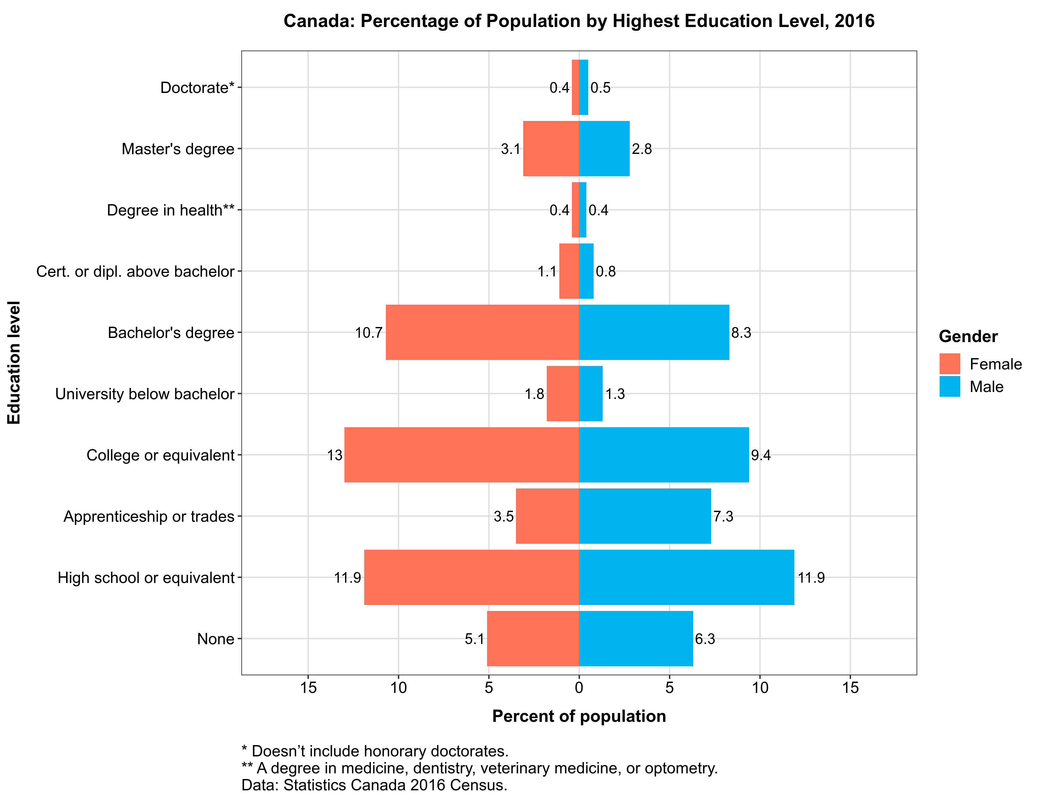
If you did everything correctly, there should be five more graphics like this one in your “output” folder – one for each region in our dataset.
Making Custom Plot Themes
The other way how you can simplify repetitive plotting tasks, is by making your own custom plot themes. Since every plot theme in ggplot2 is a function, you can easily save your favorite theme settings as a custom-made function. Making a theme is easier than writing functions to generate multiple plots, as you won’t have to write any loops.
Suppose, you’d like to save the theme of our education plots, and to use it in other plots. To do this, simply wrap theme settings in function():
## Save custom theme as a function ##
theme_custom <- function() {
  theme_bw() + # note ggplot2 theme is used as a basis
  theme(plot.title = element_text(size = 10, face = "bold",
                                  hjust = .5,
                                  margin = margin(t = 5, b = 15)),
        plot.caption = element_text(size = 8, hjust = 0,
                                    margin = margin(t = 15)),
        panel.grid.major = element_line(colour = "grey88"),
        panel.grid.minor = element_blank(),
        legend.title = element_text(size = 9, face = "bold"),
        legend.text = element_text(size = 9),
        axis.text = element_text(size = 8),
        axis.title.x = element_text(margin = margin(t = 10),
                                    size = 9, face = "bold"),
        axis.title.y = element_text(margin = margin(r = 10),
                                    size = 9, face = "bold"))
}
Note that this code takes one of ggplot2 themes as a basis, and then alters some of its elements to our liking. You can change any theme like this: a ggplot2 theme, a custom theme from another package such as ggthemes, or your own custom theme.
Let’s now use the saved theme in a plot. Usually it doesn’t matter what kind of data we are going to visualize, as themes tend to be rather universal. Note however, that sometimes the data and the type of visualization do matter. For example, our theme_custom() won’t work for a pie chart, because our theme has grid lines and labelled X and Y axes.
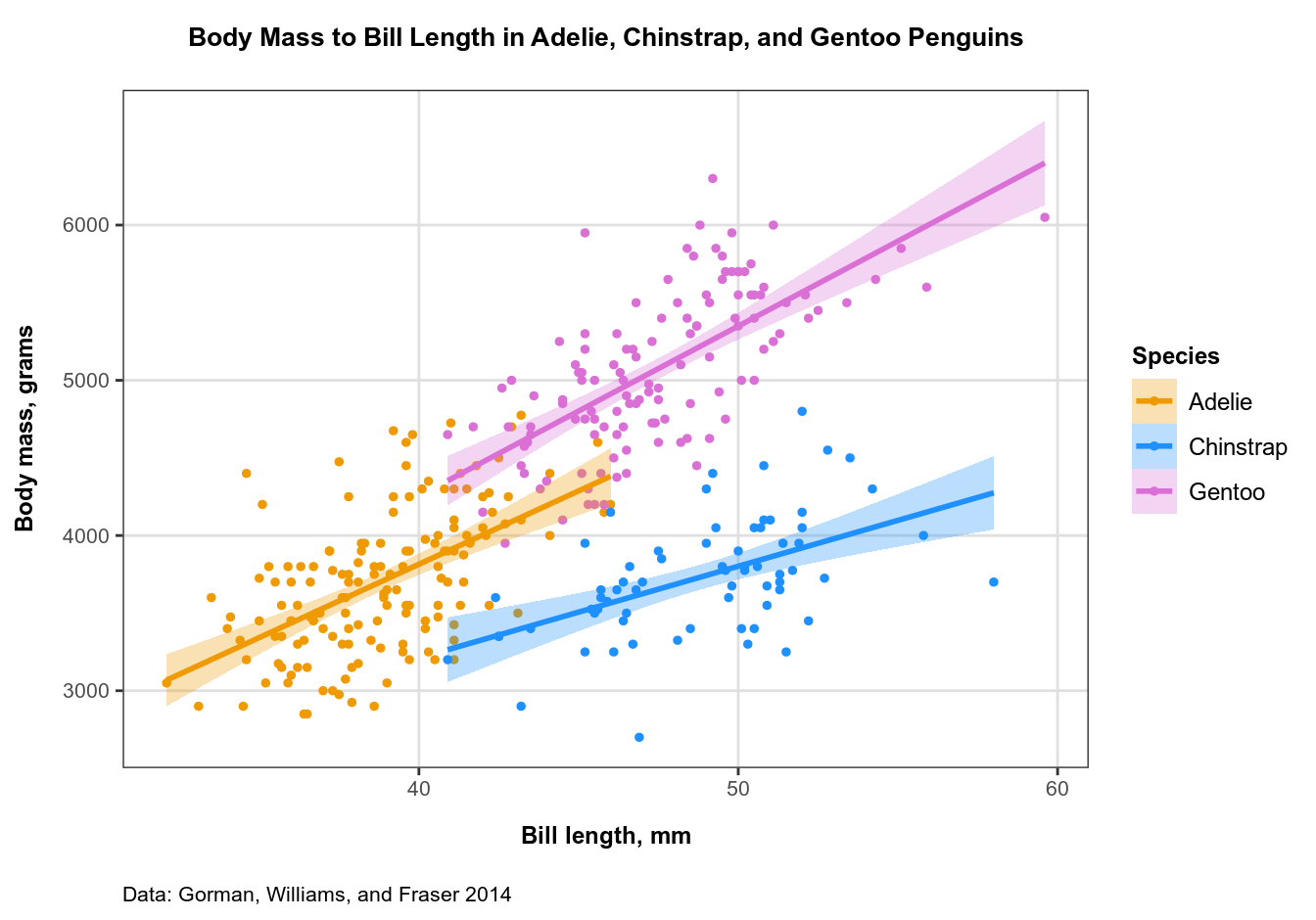
To illustrate how this theme fits an entirely different kind of data, let’s plot some data about penguins. Why penguins? Because I love Linux!
The data was originally presented in (Gorman, Williams, and Fraser 2014) and recently released as the palmerpenguins package. It contains various measurements of 3 species of penguins (discovered via @allison_horst). The package is quite educational: for example, I learned that Gentoo is not only a Linux, but also a penguin!
Let’s now make a scatterplot showing the relationship between the bill length and body mass in the three species of penguins from palmerpenguins. Let’s also add regression lines with 95% confidence intervals to our plot, and apply our custom-made theme:
## Plot penguins data with a custom theme
plot_penguins <-
  penguins %>%
  group_by(species) %>%
  ggplot(aes(x = bill_length_mm,
             y = body_mass_g,
             color = species)) +
  geom_point(size = 1, na.rm = TRUE) +
  geom_smooth(aes(fill = species),
              formula = y ~ x, # optional: removes message
              method = "lm",
              alpha = .3, # alpha level for conf. interval
              na.rm = TRUE) +
  # Note that you need identical name, values, and labels (if any)
  # in both manual scales to avoid legend duplication:
  # this merges two legends into one.
  scale_color_manual(name = "Species",
                     values = c("Adelie" = "orange2",
                                "Chinstrap" = "dodgerblue",
                                "Gentoo" = "orchid")) +
  scale_fill_manual(name = "Species",
                    values = c("Adelie" = "orange2",
                               "Chinstrap" = "dodgerblue",
                               "Gentoo" = "orchid")) +
  theme_custom() + # here is our custom theme
  labs(x = "Bill length, mm",
       y = "Body mass, grams",
       title = "Body Mass to Bill Length in Adelie, Chinstrap, and Gentoo Penguins",
       caption = "Data: Gorman, Williams, and Fraser 2014")
As usual, let’s save the plot to the ‘output’ folder and print it to screen:
ggsave("output/plot_penguins.png",
       plot_penguins,
       width = 11, height = 8.5, units = "in")
print(plot_penguins)
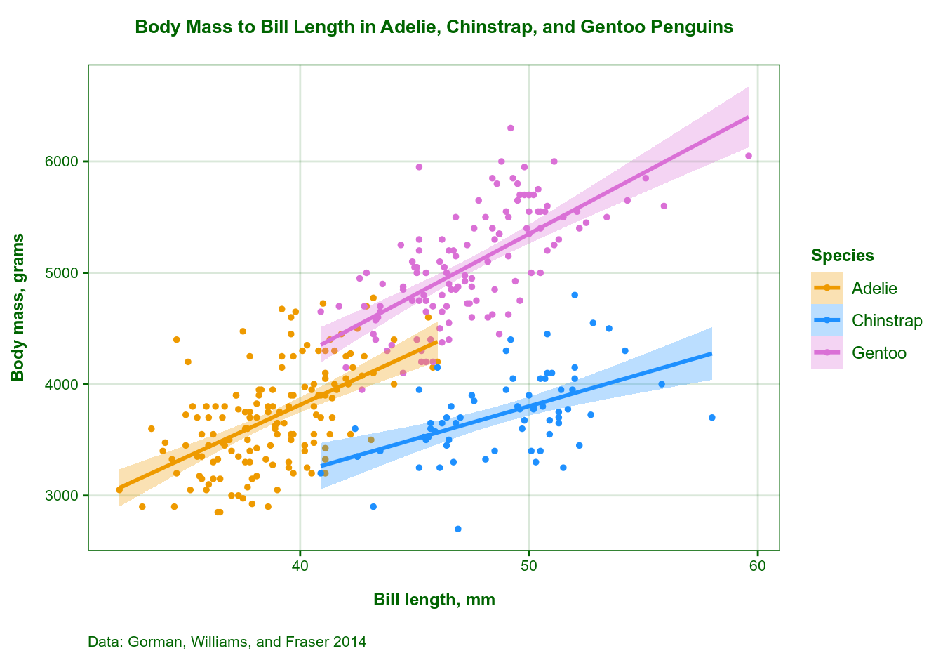
Updating Plot Themes
Now, suppose your organization uses a green-colored theme for their website and reports, so your penguin data plot needs to fit the overall style. Fortunately, updating a custom theme is very easy: you re-assign those theme elements you’d like to change, e.g. to use a different color:
# further change some elements of our custom theme
theme_custom_green <- function() {
  theme_custom() +
  theme(plot.title = element_text(color = "darkgreen"),
        plot.caption =  element_text(color = "darkgreen"),
        panel.border = element_rect(color = "darkgreen"),
        axis.title = element_text(color = "darkgreen"),
        axis.text = element_text(color = "darkgreen"),
        axis.ticks = element_line(color = "darkgreen"),
        legend.title = element_text(color = "darkgreen"),
        legend.text = element_text(color = "darkgreen"),
        panel.grid.major = element_line(color = "#00640025"))
}
Upd.: Note the use of an 8-digit hex color code in the last line: it is the hex value for the “darkgreen” color with an alpha-level of 25. This is how you can change the transparency of grid lines so that they don’t stand out too much, since element_line() doesn’t take the alpha argument. Keep in mind that if you want to use a color other than “gray” (or “grey”) for grid lines, you’d have to use actual hex values, not color names. Setting element_line(color = “darkgreen25”) would throw an error. You can find more about hex code colors with alpha values here. Thanks to @PhilSmith26 for the tip!
Then simply replace theme_custom() in the code above with theme_custom_green(). No other changes needed!
And last but not least, here is the citation for the penguins data:
Gorman, Kristen B., Tony D. Williams, and William R. Fraser. 2014. “Ecological sexual dimorphism and environmental variability within a community of Antarctic penguins (Genus Pygoscelis).” PLoS ONE 9 (3). https://doi.org/10.1371/journal.pone.0090081.
url = “https://dataenthusiast.ca/wp-content/uploads/2020/12/education.csv”
Education CSV file is no longer available, can you point me to another direction that I can download and play? thanks
Hi Rukia, many thanks for noticing this! The file ended up being uploaded to a wrong folder when I was rebuilding my website some time ago. Please check if you can download ‘education.csv’ – it should be working now.
It is working now! Thanks so very much, your tutorial blog is a treasure!
Thank you for your interest, it is always a pleasure to learn that someone finds it useful!
[sharing a crying facial icon] I have created a dataset and imported it into Rstudio, modified and used your programming codes, there were no error hints, but Rstudio would not generate the graph as it was supposed to be…
Too newbie to create an account and post questions on Stackoverflow… wanted to share an SOS icon with you
I just tested all code in ‘Writing Functions to Automate Repetitive Plotting Tasks in ggplot2’, and it works. Does R Studio throw any error or warning messages?
No, Rstudio did not throw any error messages, but the produced graph was wonky on my end, is there any way that I can upload a picture on this blog, or send you an e-mail regarding my dataset, codes and output results? Please let me know, your time and help are much appreciated!
Thank you for this excellent article It was very helpful and informative.